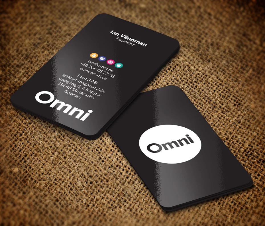
Every business is different, which means that every business will have to find their own path to getting their perfect cards. Corporate business card printing, however, follows a few different principles from personal business card printing. In contrast to personal cards, corporate cards are all about the organization, and thus self-expression is not as big of a factor. You can’t always go nuts on shapes and sizes either unless there’s a really specific purpose behind it.
However, that does not mean a corporate business card has to be bland or uncreative. These restrictions can, in fact, make for a more focused design that works more like business cards were intended to do and less like the vehicles for expression that many cards are today.
Here are some basic guidelines for corporate business card printing to help your message stand out while helping your organization meet its other objectives.
Invest in professional graphic design and printing
There are a lot of laughably bad corporate business cards out there, and you wouldn’t want to add your own to that list. In the vast majority of cases, these cards are terrible because the business owner or manager did not respect the technical challenges involved in creating a business card that works.
Business cards look deceptively simple to make. They can be, but it often takes designers and print professionals hundreds of hours of study and trial and error before they’re able to consistently make them professionally. Chances are, you don’t have the time to invest to make them properly for yourself.
The printing is especially crucial. Unless you’re doing just a very small run of business cards, chances are your home printer just won’t cut it. Over time, there will be a variance of colors in different print runs due to the nozzles heating and differences in ink batches. It can also be incredibly expensive to do it yourself, as a home printer won’t be able to take advantage of economies of scale – an important consideration for any business with a limited marketing budget.
If you’re not a professional graphic designer or printer yourself, you’d best leave designing business cards to a professional.
Add at least one stand-out design element
One problem that plagues a lot of corporate business cards is that a lot of them are well-designed in a textbook sort of way, but are utterly forgettable. By playing things safe, you’re probably going to end up with a business card design that’s not too different from the ones your competitors are using because chances are – they’re playing it safe too.
This makes it important that your card has something about it that sets it apart from the others your customers and suppliers might receive. It can be a specific graphic design element, the colors you use, a special feature or material of some sort, or even a bit of humor in the copy. Just be sure to communicate what you want with your graphic designer so that it can be properly integrated into the design.
Keep them uniform throughout your organization
With a few exceptions, there should be a few limits to how “custom” your business cards are. Even if there are differences with regards to the name of the salesperson or managers on the card, enough design elements should be the same so that the cards will be immediately identifiable as those belonging to someone from a certain company.
Stick with a standard size
Generally speaking, you want to stick with a business card size that’s widely used in your market. These sizes will be generally easier to keep in standard card cases or wallets, and therefore, less annoying for a recipient to leg around. However, there’s also a valid argument to be made that larger, unusual sizes will make it easier to catch a recipient’s attention.
If you’re in this camp, there are many printers that will do oversized corporate business card printing. Just be aware of how recipients in your market are likely to receive and use business cards, as this may be different from culture to culture.
Use a heavier cardstock
Always go with the heaviest possible cardstock that you can afford with your marketing budget. The extra heft will make them stand out from other business cards that will probably be made with a misplaced sense of economy.
A heavier card will often be associated with a brand that places an emphasis on quality and customer experience, which are things you may want your business to be associated with. Heavier business cards are also less likely to be immediately thrown away compared to cheap and flimsy cards, which allows you to share your message and stay in front of your customers and prospects for much longer.

